Client File UX/UI makeover

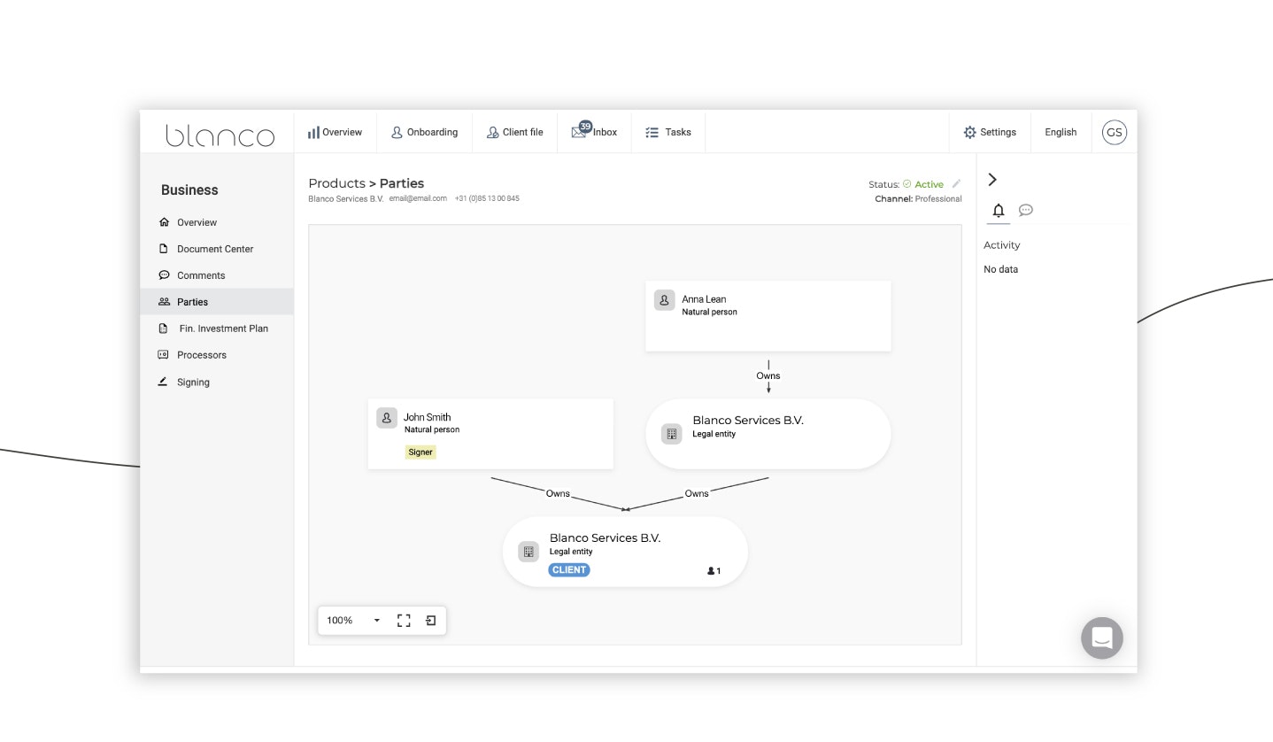
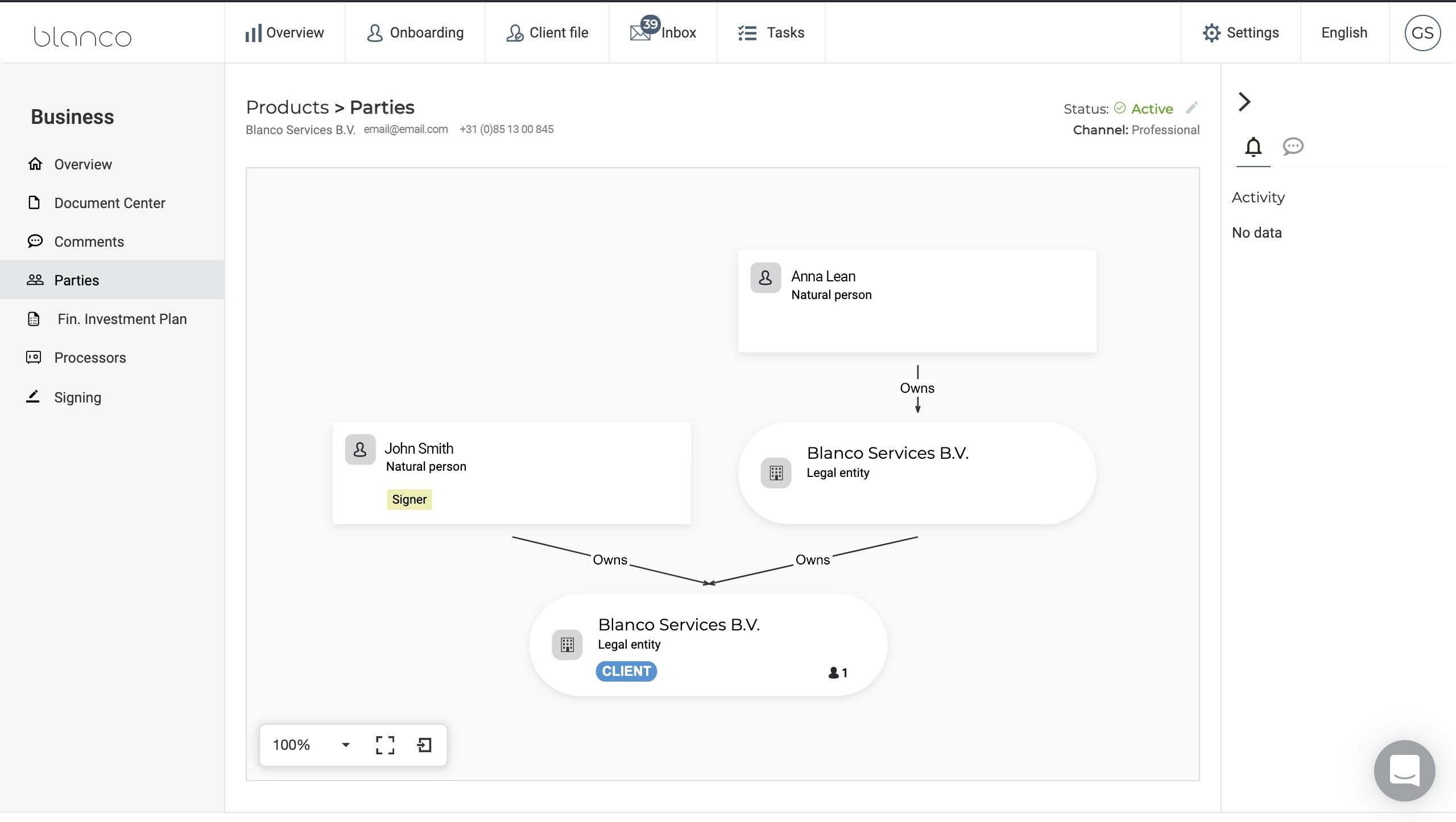
As many of you may have noticed, we gave the UX/UI of the Client File Module a serious makeover in December. The biggest innovation is the hierarchical representation of the client relationship, which gives a clear view of the ownership structure (see image). Legal representatives can be found under the small human icon. Other changes include a clear client overview with products, a special page for risk assessments, a screening page indicating the date on which the continuous screening was activated, a list of activities, and continuous access to comments. We would like to hear your views on these changes, so please feel free to share your feedback with our Customer Success team.
Subscribe to the Blanco newsletter
Subscribe to receive the latest Blanco news, articles and event invites.
